For this tutorial, we run preprocessing on the 10k PBMCs from a Healthy Donor (v3 chemistry) dataset from 10X Genomics, starting with the raw feature-barcode matrix. This dataset has been slightly modified, as we split this data randomly to represent the a use-case where we have 4 patient samples, each containing cells from 3 timepoints (obtained using cell-hashing for example). This is to highlight the multi-sample capabilities of scanalysis. Additionally, we removed barcodes with zero UMI counts to speed up computation. Our data is in the form of a list of SingleCellExperiment objects
First, we load scanalysis and load the dataset.
library(scanalysis)

dataset = get_multi_sample_pbmc_10k()
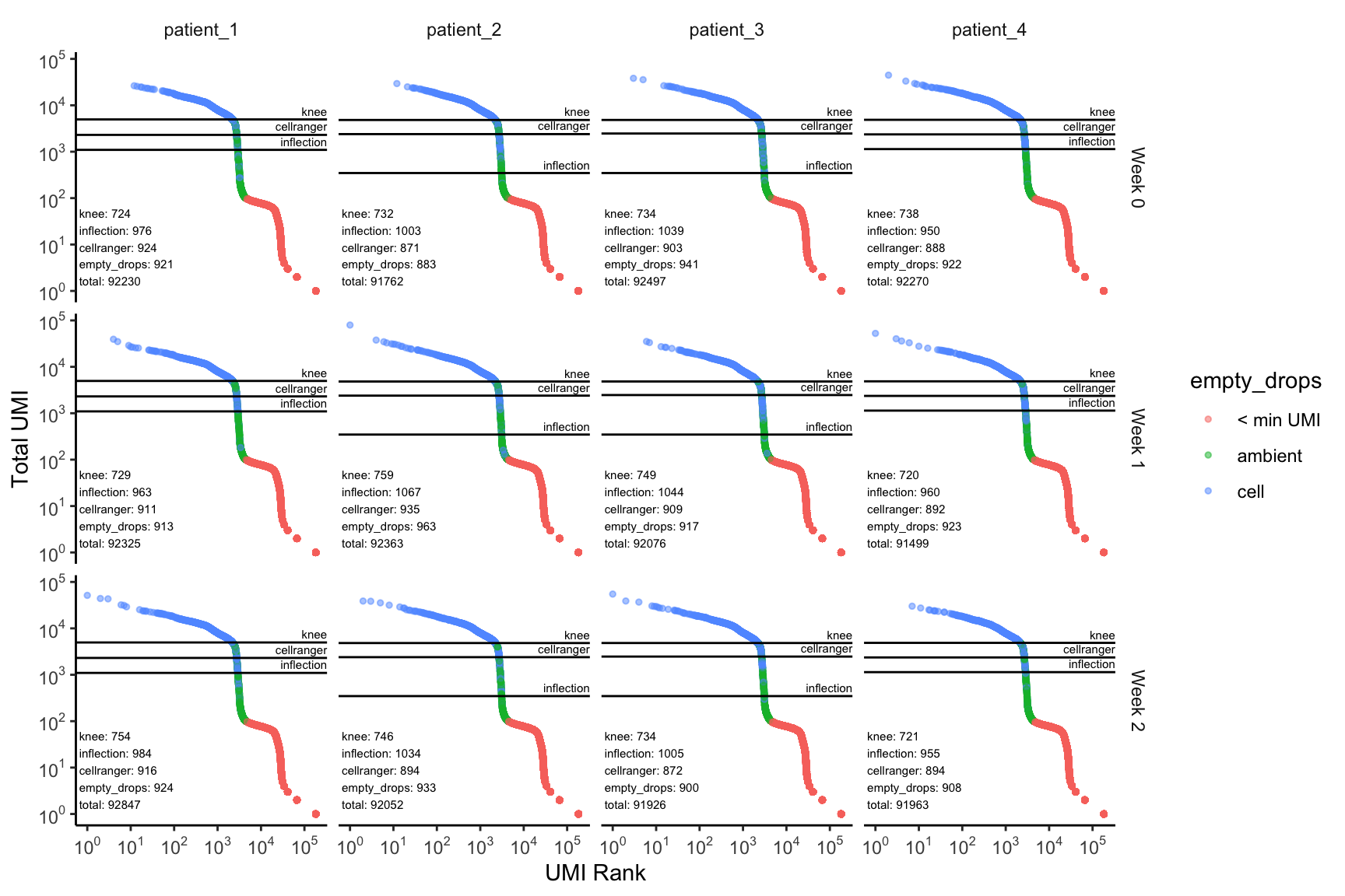
The next step is to identify droplets that actually contain cells. The filter_ambient_barcode function is used for this. It runs four different methods for identification of cell-containing barcodes:
- emptyDrops (empty_drops)
- Total UMI cutoff of 10% of the 99th percentile of UMI counts from the top N barcodes (cellranger)
- Total UMI cutoff based on the inflection point in the barcode distribution (inflection)
- Total UMI cutoff based on the knee point in the barcode distribution (knee)
All four methods are always run to understand how each of the methods compare, as the results are often dataset-dependent.
ambient_rna_filters = purrr::map(dataset, ~ filter_ambient_barcode(.x, 2500))Each one of these results contains a list of booleans indicating which barcodes contain cells. Additionally, each result has attributes that are used in the following plotting function. We now plot the results of each of these filtering methods.
plot_barcode_qc(sce_list = dataset,
                ambient_rna_filters = ambient_rna_filters,
                facet_columns = ".sample",
                facet_rows = "timepoint")
Here, for each sample, and timepoint within each sample, we have a barcode distribution plot, fully annotated with the cutoffs based on each of the methods, as well as the number of cells retained by each of the individual filters. We now use this visualization to decide that using the emptyDrops filter looks fine, and, as expected, gives us the most number of cells recovered.
cell_dataset = purrr::map2(dataset, ambient_rna_filters, ~ .x[, .y$empty_drops == TRUE])Now that we have identified barcode-containing cells, we now filter cells based on common QC measures, such as the total number of UMIs/genes expressed per cell to identify low-content cells and doublets and the percentage of mitochondrial reads to identify low-quality dying cells. We first must annotate these values into the colData of each dataset.
cell_dataset = purrr::map(
  cell_dataset,
  ~ .x %>%
    annotate_total_umi_count %>%
    annotate_n_genes_expr %>%
    annotate_pct_gene_set("^MT-", "pct_mito")
)
Now that these values are annotated, we can use the scater::isOutlier to identify outliers based on these values. We consider values greater than 2 median absolute deviations on both sides an outlier for total UMI count and number of genes expressed, and values greater than 1 median absolute deviations above for the percentage of mitochondrial reads, though it should be noted that this parameter was adjusted based off of the below plots to remove most of the upper mode total UMI/number of genes expressed in the data which likely corresponds to doublets.
total_umi_filters = purrr::map(cell_dataset, ~ filter_total_umi(.x, nmads = 1, type = "both"))

n_genes_expr_filters = purrr::map(cell_dataset, ~ filter_n_genes_expr(.x, nmads = 1, type = "both"))

pct_mito_filters = purrr::map(cell_dataset, ~ filter_pct_mito(.x, nmads = 2, type = "higher"))
With these filters, we can plot univariate distributions as well as scatterplots to show the outliers when considering two measures simultaneously.
plot_gex_univariate_qc(
  cell_dataset,
  x_filters = total_umi_filters,
  x = "total_umi",
  color = "pct_mito",
  facet_columns = ".sample",
  y = "timepoint",
  nrow = 1
)
plot_gex_univariate_qc(
  cell_dataset,
  x_filters = n_genes_expr_filters,
  x = "n_genes_expr",
  color = "pct_mito",
  facet_columns = ".sample",
  y = "timepoint",
  nrow = 1
)
plot_gex_univariate_qc(
  cell_dataset,
  x_filters = pct_mito_filters,
  x = "pct_mito",
  color = "total_umi",
  facet_columns = ".sample",
  x_log = FALSE,
  y = "timepoint",
  nrow = 1
)
plot_gex_bivariate_qc(
  cell_dataset,
  x_filters = total_umi_filters,
  y_filters = n_genes_expr_filters,
  x = "total_umi",
  y = "n_genes_expr",
  color = "pct_mito",
  facet_columns = ".sample",
  facet_type = "wrap",
  nrow = 1
)
We can use these filters to drop the outliers as follows:
cell_dataset = purrr::pmap(list(cell_dataset, total_umi_filters, n_genes_expr_filters, pct_mito_filters),
                           ~ ..1[, ..2 & ..3 & ..4])
We plot the data again to show the post-filtering dataset:
plot_gex_univariate_qc(
  cell_dataset,
  x_filters = total_umi_filters,
  x = "total_umi",
  color = "pct_mito",
  facet_columns = ".sample",
  y = "timepoint",
  nrow = 1
)
plot_gex_univariate_qc(
  cell_dataset,
  x_filters = n_genes_expr_filters,
  x = "n_genes_expr",
  color = "pct_mito",
  facet_columns = ".sample",
  y = "timepoint",
  nrow = 1
)
plot_gex_univariate_qc(
  cell_dataset,
  x_filters = pct_mito_filters,
  x = "pct_mito",
  color = "total_umi",
  facet_columns = ".sample",
  x_log = FALSE,
  y = "timepoint",
  nrow = 1
)
plot_gex_bivariate_qc(
  cell_dataset,
  x_filters = total_umi_filters,
  y_filters = n_genes_expr_filters,
  x = "total_umi",
  y = "n_genes_expr",
  color = "pct_mito",
  facet_columns = ".sample",
  facet_type = "wrap",
  nrow = 1
)
Now the data falls within the filters as expected. Note that the numbers annotated here are smaller than those within the filters on the univariate/bivariate plots above. This is because the intersection of all 3 filters are used.
The data is ready to be used in downstream analysis!